.png)

Designing Real-Time Transit Decision Making for MTA Riders
Designing a real-time transit experience that helps riders navigate disruptions with confidence.
Interaction Design • Mobile UX • Decision Support Systems • Real-Time Information Design
Purpose
The goal of this project was to design a mobile experience that emphasizes usability, streamlines navigation, and provides clear access to real-time transit information. This design focuses on reducing friction during time-sensitive travel situations and creating a more intuitive experience for both daily commuters and occasional riders.
Scope
The project included:
-
Competitive analysis of existing transit applications
-
User interviews and exploratory research
-
User journey mapping
-
Persona development
-
Information architecture
-
Low-fidelity wireframing
-
High-fidelity prototyping
-
Usability testing and iterative design improvements
Methodology
Research
-
Competitive analysis of transit apps
-
User interviews
-
User journey mapping exercises
-
Affinity mapping in Miro
Design
-
Persona creation
-
Journey mapping
-
Low-fidelity wireframes
-
High-fidelity prototype development
Validation
-
Six moderated usability tests conducted
using the high-fidelity prototype
Project Process
Project Length: 20 weeks
Design team: Jamie Robinson, Madison Heise, Madison Korteling
Research
Ideation
Low-Mid Fidelity
High Fidelity
Usability Testing
Design Iterations
Design Challenge
Urban commuters frequently encounter delays, route changes, and service disruptions that require quick decision-making. Riders need a transit experience that surfaces relevant information, recommends next steps, and reduces uncertainty while traveling.
How might we help riders understand disruptions and take action quickly during their journey?
Research
Competitive Analysis
To kick off our project, my team and I conducted a competitive analysis of several major transit apps to understand current strengths, weaknesses, and user expectations. We evaluated the MBTA, MTA, SEPTA, CityMapper, Amtrak, DDOT Bus Tracker, and Transit apps—focusing on factors like usability, real-time data accuracy, trip planning features, accessibility, and visual design. This research laid the foundation for identifying key opportunities to improve the MTA app experience.
Click to view Google sheet.

Exploratory Research
We then moved into the exploratory research phase of our project where we conducted user interviews and user journey mapping exercises to explore the public transportation problem space. These activities helped identify key pain points, behaviors, and unmet needs, providing valuable insights to guide user-centered design solutions. We placed these insights into an affinity diagram on Miro.
Click to view Miro board.

Click to view data from user journey exercise.

Based on these insights from our user interviews and journey mapping exercises, we developed user personas and a comprehensive user journey map to represent key behaviors, needs, and pain points within the public transportation experience. These artifacts guided our design decisions and ensured alignment with real user challenges.
User Personas

.jpeg)
These personas reflect two user types we identified in our research:
1. The Daily User
-
Profile: A local, routine commuter who relies on public transportation for work, school, and social activities.
-
Key Traits: Familiar with the system, values efficiency, consistency, and cleanliness.
-
Primary Needs: Optimized routes, proactive communication, crowding updates, and seamless integration with digital tools.
2. The Traveler
-
Profile: An occasional or international user unfamiliar with the local system, often navigating new environments.
-
Key Traits: Easily disoriented, prefers simplicity and clarity, sensitive to time delays and information overload.
-
Primary Needs: Clear visual guidance, multilingual support, real-time updates, and user-friendly navigation.
User Journey Map

1. Riders Need Faster Access to Critical Information
Users frequently struggled to locate real-time service updates when they needed them most.
2. Personalization Matters
Users wanted information tailored to their preferred routes and travel patterns.
3. First-Time Riders Need More Guidance
Occasional riders and tourists experienced confusion around navigation, ticketing, and transfers.
4. Trust Depends on Data Accuracy
Inconsistent visuals and inaccurate transit information reduced confidence in the app experience.
Key Findings
Main Issues
1. Navigation Friction
-
Critical transit information required too many steps to access.
-
Route planning and service updates were not prioritized effectively.
2. Weak Information Hierarchy
-
Important updates competed with less relevant content.
-
Users struggled to quickly identify delays and service changes.
3. Onboarding Gaps
-
Users expected clearer account setup and onboarding guidance.
-
Onboarding tasks felt disconnected from the core app experience.
4. Design Inconsistencies
-
Visual inconsistencies reduced user trust.
-
Ticketing and multi-leg trip guidance lacked clarity.
1. Improve Real-Time Information Visibility
-
Surface train and service updates directly on the home screen.
-
Prioritize delay and disruption alerts.
2. Simplify Navigation
-
Reduce the number of steps required to access critical information.
-
Create clearer route-planning pathways.
3. Strengthen Personalization
-
Tailor home screen content based on user preferences and travel history.
-
Connect onboarding preferences to personalized experiences.
4. Increase Trust Through Consistency
-
Standardize visual elements.
-
Improve accuracy of station imagery and live data presentation.
-
Clarify ticketing and transfer information.
Recommendations
Ideation
My design team and I conducted a collaborative brainstorming session to explore potential solutions within the public transportation space. Each team member generated at least 10 unique ideas, followed by a feedback round where we shared constructive input to refine and build on each other's concepts.
Click to view Miro board.

Low-Mid Fidelity – Figma
Following our brainstorming session, we transitioned into creating low-fidelity wireframes in Figma to visualize and explore key concepts. These initial designs helped us quickly prototype ideas, test layout possibilities, and align on core user flows before moving into higher-fidelity iterations.
Click to view Figma page.

After completing our first round of low-fidelity wireframes, our team held an internal critique session to exchange feedback on design decisions, usability, and overall flow. We incorporated this feedback to produce a second iteration of lo-fi wireframes, refining our concepts before moving forward with user testing.
Click to view Figma page.

We conducted user feedback sessions on our updated low-fidelity wireframes, with each team member interviewing three users to assess usability and gather insights. Based on the feedback, we refined our designs and advanced them to mid-fidelity screens, incorporating clearer visuals and improved interactions.
The main improvements from low-mid fidelity screens/workflows include:
-
The removal of option 1 for onboarding and trip planning (chatbot feature, wasn't as well received as step by step option
-
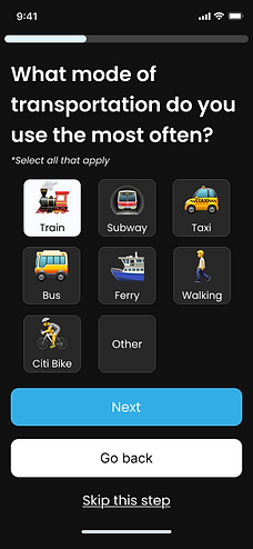
Contextualize onboarding based on the target audience. If the app is intended for different types of users (e.g., frequent vs infrequent travelers), tailor the initial questions to their specific needs and motivations
-
On homepage:
-
Ensure quick actions, upcoming trips, and notifications are highly visible and easily accessible. Users value these elements being front and center.
-
Prominently display upcoming trips. This was a consistently liked feature.
-
Integrate delay information directly into the upcoming trip cards. Users found this helpful.
-
-
Prioritize the development and reliable delivery of real-time delay alerts.
-
Focus on making notifications actionable. Instead of just providing information, offer clear calls to action.
-
Adding visual confirmation for each navigation step
Click to view Figma page.


Updated Interaction Flows and Artifacts


High Fidelity – Figma
Our team met to align on the visual direction of the app, discussing color schemes, typography, and overall aesthetic to ensure consistency with our design goals and user needs. With a shared visual language established, we began developing high-fidelity wireframes to bring the experience to life with polished UI elements.


Click to view Figma page.

Hi-Fi Wireframes


Usability Testing
My design team and I then conducted six usability tests using our high-fidelity prototype to gather valuable feedback and identify areas for improvement in the user experience. From this we gained the following insights:
Overall User Experience
-
General Sentiment: Users found the app intuitive, sleek, and visually modern, giving an average rating of 3.81/5.
-
Strengths: Clean UI, easy navigation, effective onboarding for most users.
-
Areas to Improve: Address confusion for first-time users, especially those unfamiliar with transit apps. More intuitive visuals and clearer messaging needed.
Onboarding Experience
-
Strengths:
-
Clear and structured onboarding flow.
-
Friendly interface increased trust and initial engagement.
-
-
Issues Identified:
-
Users expected sign-up/login prompts up front.
-
Some onboarding tasks felt disconnected.
-
Dark backgrounds, cut-off UI elements, and overly long headings.
-
Lack of clarity around what users should do next.
-
-
Recommendations:
-
Clarify purpose and language in onboarding.
-
Improve visual design (color, spacing, text prominence).
-
Tie onboarding tasks more directly into main app usage.
-
Include prompts like “Plan your first trip” and better indicate next steps.
-
Delay Information
-
Strengths:
-
Users found delay notifications informative when clearly presented (home screen alerts were especially appreciated).
-
Color-coded delays were positively noted.
-
-
Challenges:
-
Users had difficulty accessing helpful rerouting information.
-
Delay handling often felt cluttered or overwhelming.
-
Lack of comforting or contextual messaging during delays.
-
Trip Planning & Navigation
-
Strengths:
-
Users appreciated route sorting and the search
-
Filtering options were helpful
-
-
Common Issues:
-
Users expected route lines, but they were missing or unclear.
-
Current location was hard to identify or too subtle.
-
Trip options lacked distinction between transit modes.
-
Users preferred more than one route option.
-
-
Navigation Feedback:
-
The route map lacked usefulness during navigation.
-
Progress indicators were unclear or inconsistent.
-
Wants more detail for each step (one step at a time)
-
Home Screen & Personalization
-
Strengths:
-
Users liked the ability to add home/work locations.
-
Personalization features like station favoriting were appreciated.
-
-
Issues:
-
Users expected to see real-time info for all nearby trains, not just favorites.
-
The “Welcome back” message was inaccurately triggered for first-time users.
-
Specific Insights
Iterations
Based on the insights gathered from these usability tests, we iterated on our design to address pain points, enhance usability, and better align the experience with user needs.
Click here to view Figma page.
We added a new prompt for login or account registration


We improved onboarding and the home screen by:
-
Updating the sizing of elements on the onboarding screens to ensure clarity
-
Updating the Home Screen to use the information collected during onboarding
-
Adding more helpful/detailed information in the case of delays


In addition, we improved the navigation/wayfinding flow by:
-
Updating the search
-
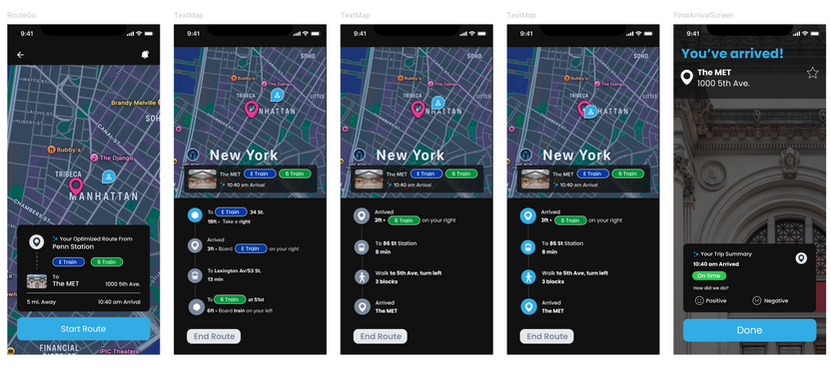
Adding a route line to the map
-
Adding more visual indicators/prioritizing important information in the route options list
-
Increasing detail in the step by step navigation


Project Conclusion
If we were to continue this project, we would:
-
Implement AI-powered smart rerouting to optimize real-time navigation
-
Add camera landmarks and visual cues to support clearer, more intuitive wayfinding
-
Utilize analytics to highlight crowded or high-traffic areas for better decision-making
-
Conduct additional usability testing to refine new features based on user feedback
-
Explore integration with third-party mapping or transit platforms to enhance functionality
-
Improve accessibility features to support a wider range of users and mobility needs