.png)

UX Audit: ClickUp
Onboarding & Workspace Setup
Identifying friction in onboarding, dashboard complexity, and first-time workspace usability.
Focus: SaaS Onboarding • Dashboard UX • Cognitive Load Reduction • Product UX Redesign
Purpose
This audit evaluates ClickUp’s onboarding and workspace setup experience to identify usability friction impacting:
-
first-time user clarity
-
workspace setup completion
-
feature discoverability
-
onboarding confidence
-
Time to First Value (TTV)
The goal is to simplify the onboarding experience and create a more guided, user-centered workflow for new users entering a highly feature-rich product environment.
Scope
This audit focuses on:
-
account signup
-
onboarding questionnaire
-
workspace creation
-
initial dashboard experience
-
navigation hierarchy
-
task/project setup
-
onboarding guidance
-
feature prioritization
Methodology
This audit uses a hybrid UX evaluation framework:
-
Nielsen’s 10 Usability Heuristics
-
SaaS onboarding analysis
-
Cognitive load evaluation
-
Information hierarchy assessment
-
User flow analysis
-
Time-to-Value (TTV) assessment
-
Progressive disclosure analysis
User Journey
Existing Account Creation Flow

Flow Analysis
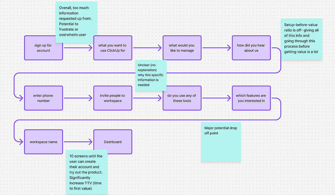
The onboarding experience introduces users to a highly customizable and feature-dense environment very early in the experience. While flexibility is one of ClickUp’s strengths, the current onboarding flow may create cognitive overload for first-time users by presenting too many decisions before users establish orientation or reach meaningful value.
Existing Dashboard

1. Weak Primary User Path
The interface presents many equally weighted features and navigation options immediately after onboarding.
Users may struggle to identify:
-
where to begin
-
what action matters most
-
how to achieve their first success moment
UX Impact
Lack of guided progression may reduce onboarding confidence and increase abandonment risk.
2. Feature Exposure Too Early
Advanced functionality is surfaced before users understand foundational workflows.
UX Impact
Premature feature exposure may:
-
distract users
-
increase confusion
-
delay activation
3. Cognitive Overload During Onboarding
Users are asked to make multiple configuration decisions early in onboarding, including:
-
use case selection
-
team structure
-
workflow preferences
-
layout options
-
integrations
-
templates
before fully understanding the product ecosystem.
UX Impact
This may:
-
increase onboarding fatigue
-
slow Time to First Value
-
create decision paralysis
-
overwhelm less technical users
4. Information Hierarchy Issues
The dashboard contains:
-
dense sidebar navigation
-
numerous feature modules
-
multiple CTA types
-
heavy visual information density
Important actions compete equally for user attention.
UX Impact
This may:
-
reduce scanability
-
increase cognitive strain
-
make onboarding feel more complex than necessary
Key Findings
Main Issues
1. Too many decisions early during onboarding.
This could lead to increased onboarding fatigue.
2. High information density in the dashboard.
This could lead to cognitive overload.
2. High information density in the dashboard.
This could lead to cognitive overload.
3. Lack of guided path to first success.
Weak onboarding guidance and advanced features surfaced too early reduces usability for new users.
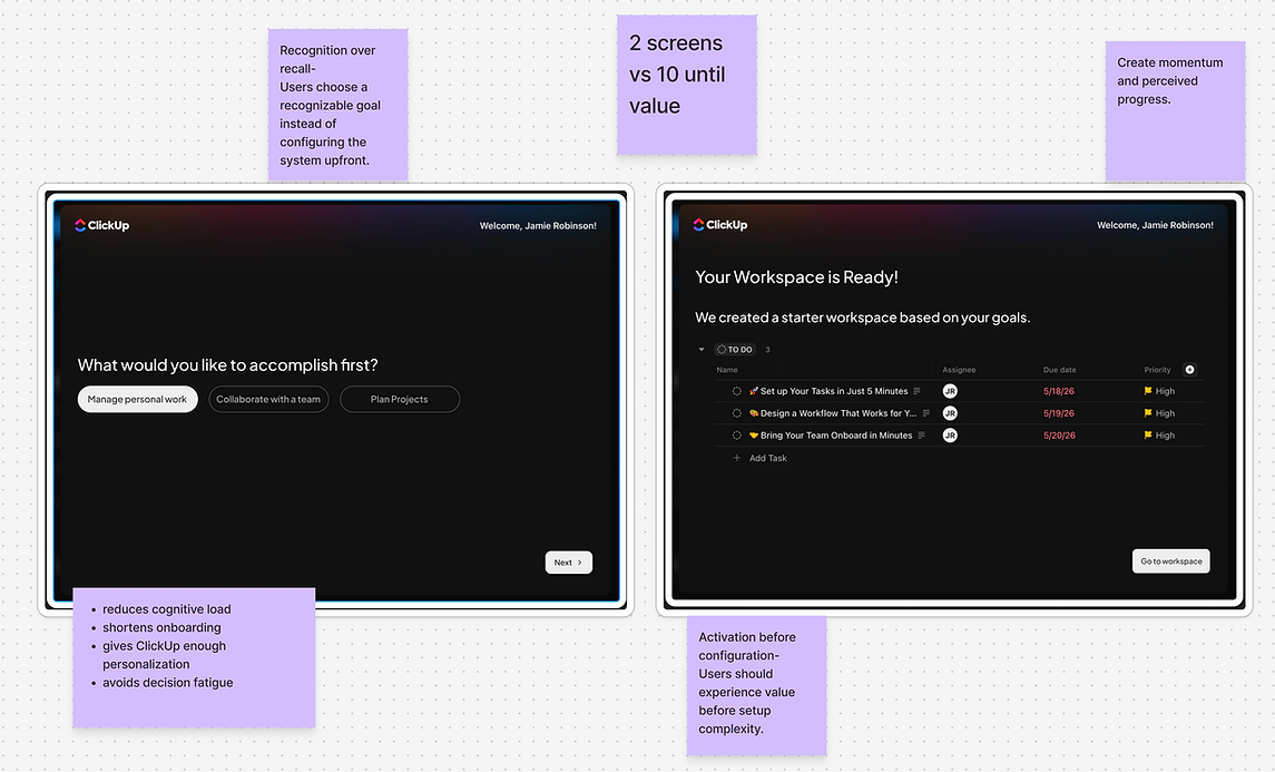
1. Introduce Guided Onboarding Progression
Break onboarding into smaller, more contextual steps tied directly to immediate user goals.
Improvements
-
progressive onboarding
-
setup checklist
-
milestone progression
-
contextual explanations
-
simplified early choices
2. Create a Stronger First Success Path
Guide users toward one clear, high-value first action immediately after onboarding.
Improvements
-
create first task
-
invite teammate
-
start first project
3. Reduce Dashboard Complexity for New Users
Introduce progressive disclosure to hide lower-priority functionality until users gain familiarity.
Improvements
-
simplified beginner mode
-
collapsible modules
-
onboarding-focused layouts
-
feature staging
4. Improve Information Hierarchy
Visually prioritize:
-
primary onboarding actions
-
current tasks
-
recommended next steps
while reducing competing visual elements.
Recommendations
Redesign Concept
Guided Onboarding
Clearer Hierarchy
Contextual education
Stronger onboarding progression
Expected Outcomes
This redesign aims to:
-
improve onboarding completion
-
reduce cognitive overload
-
shorten Time to First Value
-
improve onboarding confidence
-
create a more intuitive product experience
UX Principles Applied
-
Cognitive Load Reduction
-
Progressive Disclosure
-
Information Hierarchy
-
User Flow Optimization
-
Onboarding Clarity
-
SaaS Activation UX
-
Usability Heuristics
Updated UI
Figma Screens


ClickUp’s flexibility and feature depth are powerful strengths, but the onboarding experience introduces significant complexity before users establish confidence within the platform.
Simplifying onboarding, reducing early decision fatigue, and creating a more guided first-time experience would improve usability and help users reach value faster.